Photography A1:
Composite
Definition and Theory:
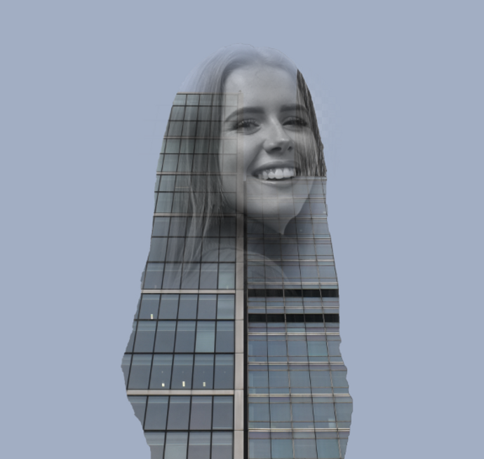
Composite images are made up of two or more photographs, which are combined to create one image.
What is a Digital Composite?
Digital compositing is the process of digitally assembling multiple images to make a final image, typically for print.
This is rendered significantly less complicated thanks to the advent of digital photography, digital editing, and an ever expanding set of features and tools available with modern software and apps.
This photographic sorcery didn’t start with the advent of Photoshop - in fact, quite the opposite. Before digital photography was even a twinkle in Steven Sasson’s eye, composite portraiture was already being practised in the 1880’s when Sir Francis Galton invented a technique to take multiple exposures on the same photographic plate.
What is Photoshop?
An image editing software often used to manipulate the captured image to an extent determined by the artist/re-toucher. Arguably Photoshop can be used in a similar way to Dark room processing of prints. The artist can however manipulate images far beyond the capabilities of conventional dark room techniques.
My Image Bank:


Photographer: Adrian Sommeling
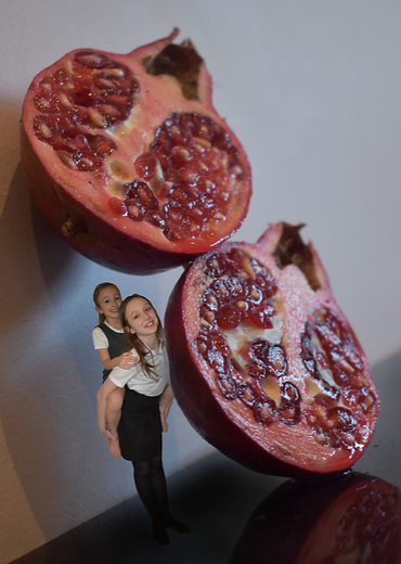
Commercial photographer known for his conceptual work. He is also a digital artist and works with Photoshop as well, creating surreal images that play with scale and perspective. He shares his unique photography with his over 50,000 Instagram followers. Apart from his passion for creation he loves the interaction with clients. He deeply believes in teamwork as one of the best means to improve and get any company’s achievements. I enjoy his work as the sense of realism is strongly given within all of his photographs and the interesting choices in the objects he has chosen to manipulate.


Photographer: Erik Almas
Erik Almas was born in Trondheim, Norway and moved to San Francisco to study photography at the Academy of Art at the age of 22. He graduated in 1999 with the distinction of Best Portfolio. In 2004, the Academy awarded him Honorary Degree of Outstanding Alumnus. He is well known for his style where he combines the beauty of an environment, the beauty of personalities, all tied by a romantic vibe. He has a peculiar love for low light and uses colour to convey emotion. His fingerprints are visible throughout all of his work, both in personal and commercial assignments. I like the style of his work implying a theme of landscape as well as the realism effect it applies.


My Practise Task:
Before taking any shoots or deciding what photographs to use from previous shoots I used some secondary photos to practise some of my Photoshop composite skills. I used images of the Tower Bridge landmark in London, along side the image of a rubber duck usually used in a bath tub for younger children.

Images chosen to be used:

These photographs are the images that I used within my composite edits. They are from previous shoots as well as a few being from a shoot that I carried out before selecting which photographs I would like to use in this topic.


My Edited Images that need Improvements:

I believe that the idea behind these edits had the intentions of being very creative, but lacked success in the final outcome and due to the fact that I am still learning how to edit and use Photoshop successfully.

Personally, I do not believe that these images were to the best of my ability in terms of the final outcome after proceeding through my different editing process'.

AO3: Record ideas, observations and insights relevant to intentions, reflecting critically on work and progress.
My Editing Process:


Throughout most of my edits the process of using the Brush Tool was most commonly used to add more detail and define the outlines of the objects to merge successfully on top of the chosen background.
AO2: Explore and select appropriate resources, media, materials, techniques and processes, reviewing and refining ideas as work develops.

Another main tool that I used was the process of selecting the item, object or human and masking it to allow it to become separate from the background.


My Edited Images:


In some of the edits I followed these rough steps after noting them roughly...
Select and feather the model, Copy model, Rename the new layer (Model), Delete original layer, Crop the image, Select no layer, Click on circle image and click solid colour, Choose the colour white, Place colour fill underneath the model layer, Label that layer as Background, Make model black and white (in adjustments), Insert new image and label layer, Change opacity to 50% on new layer, Move around the new layer to where you want it be placed, Click model layer, Ctrl and click model again, Drag new model layer above other layers (holding Alt), Make that layer Lighten and lower down the opacity to 50%


AO4: Present a personal and meaningful response that realises intentions and, where appropriate, makes connections between visual and other elements.